SparkFun Forums 

Where electronics enthusiasts find answers.

Questions relating to designing PCBs
By Dmitry Shalnov
#126352
Hi everybody,

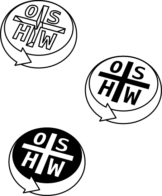
Open Hardware logo competition is finished, but result makes me (and as I suppose, not only me but a lot of people with proper taste) hm... a bit oppress. So I peen my (as people name it) "copyleft" logo up and would like to share with community.

Image

here is Eagle library (in vector, single and text version)
here is micro-guide
and graphics sources

please, feel free to use :)

This work is licensed under a Creative Commons Attribution-ShareAlike 3.0 Unported License.
Last edited by Dmitry Shalnov on Wed May 04, 2011 8:57 am, edited 1 time in total.
By Dmitry Shalnov
#126365
that's good that design still does not fall into the category of standards and everyone is free to choose their own that conforms more to own taste.

Moreover, as you can imagine, this process is akin to the evolutionary order and there is open source, where ones can use ideas of other and make their own derivatives. but eventually, what will be chosen in a natural way - it's impossible to predict. Even more impossible to impose something on purpose. just share it and let it lives by it's own life :wink:

PS. honestly, my logo was about 70 votes less (proof-link), so you may compare symbol above with winner (below) and make your own choice. I believe that this an embarrassing mistake, caused by banal lack of averaged audience taste. In my personal opinion this is a very poor job, which I, for example, wouldn't use. I dare to guess that many people share my opinion. So I just decide to refine my sign and share with community.

Image
this is a winner
By NleahciM
#126386
Dmitry Shalnov wrote:that's good that design still does not fall into the category of standards and everyone is free to choose their own that conforms more to own taste.

Moreover, as you can imagine, this process is akin to the evolutionary order and there is open source, where ones can use ideas of other and make their own derivatives. but eventually, what will be chosen in a natural way - it's impossible to predict. Even more impossible to impose something on purpose. just share it and let it lives by it's own life :wink:

PS. honestly, my logo was about 70 votes less (proof-link), so you may compare symbol above with winner (below) and make your own choice. I believe that this an embarrassing mistake, caused by banal lack of averaged audience taste. In my personal opinion this is a very poor job, which I, for example, wouldn't use. I dare to guess that many people share my opinion. So I just decide to refine my sign and share with community.

Image
this is a winner
The kerning is completely off in "the winner". It is funny to me that that is the design that was chosen. Not too surprising, but still funny.

edit: come to think of it, what may be worse than the kerning is that they used more than two colors. So let's see here - this logo is supposed to go on PCBs... how? I guess you can use holes in the soldermask as your third color - but then you'll want to not use that part of the PCB for routing so that you don't have risk of shorts... What a stupid choice.
By macegr
#126452
As long as people are posting what might have been...I made a couple logo designs a while back but since everyone putting up logo designs claimed to be some graphic designer or whatever, I thought my ideas would just get laughed at. Might still happen but here they are:

Image

Image